Anisotropy
Natural phenomena are created by physical processes. Often these physical processes have preferred orientations. For example, at the mouth of a river the coarse material settles out fastest, while the finer material takes longer to settle. Thus, the closer one is to the shoreline the coarser the sediments while the further from the shoreline the finer the sediments. When interpolating at a point, an observation 100 meters away but in a direction parallel to the shoreline is more likely to be similar to the value at the interpolation point than is an equidistant observation in a direction perpendicular to the shoreline. Anisotropy takes these trends in the data into account during the gridding process.
Usually, points closer to the grid node are given more weight than points farther from the grid node. If, as in the example above, the points in one direction have more similarity than points in another direction, it is advantageous to give points in a specific direction more weight in determining the value of a grid node. The relative weighting is defined by the anisotropy ratio. The underlying physical process producing the data as well as the sample spacing of the data are important in the decision of whether or not to reset the default anisotropy settings. Anisotropy is also useful when data sets use fundamentally different units in the X and Y dimensions. See below for examples.
Detailed discussions of anisotropy and Kriging as well as anisotropy equations are given in the variogram help topics.
The Anisotropy options are displayed in the Options page of the Grid Data dialog when a gridding method that supports anisotropy is selected..
|
|
|
Set the anisotropy options in the Grid Data Options dialog. |
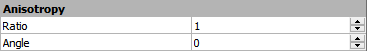
Ratio
The Ratio is the maximum range divided by the minimum range. An anisotropy ratio less than two is considered mild, while an anisotropy ratio greater than four is considered severe. Typically, when the anisotropy ratio is greater than three the effect is clearly visible on grid-based maps.
Unless there is a good reason to use an anisotropy ratio, you should accept the default value of 1.0.
Angle
The Angle is the preferred orientation (direction) of the major axis in degrees. 0 degrees is defined as east-west orientation. 90 degrees is defined as north-south orientation. Angles rotate counterclockwise.
Ellipse
In the most general case, anisotropy can be visualized as an ellipse. The ellipse is specified by the lengths of its two orthogonal axes and by an orientation angle. In Surfer, the lengths of the axes are called Radius 1 and Radius 2. The orientation angle is defined as the counterclockwise angle between the positive X axis and Radius 1. Since the ellipse is defined in this manner, an ellipse can be defined with more than one set of parameters.
For example:
Radius 1 = 2
Radius 2 = 1
Angle = 0
is the same ellipse as
Radius 1 = 1
Radius 2 = 2
Angle = 90
|
|
|
The anisotropy angle is the angle between the positive X axis and the ellipse axis associated with Radius 1. |

For most of the gridding methods in Surfer, the relative lengths of the axes are more important than the actual length of the axes. The relative lengths are expressed as a Ratio in the Anisotropy section. The ratio is defined as Radius 1 divided by Radius 2. Using the examples above, the ratios are 2 and 0.5. The ratio of 2 indicates that Radius 1 is twice as long as Radius 2. The Angle is the counterclockwise angle between the positive X axis and Radius 1. This means that:
Ratio = 2
Angle = 0
is the same ellipse as
Ratio = 0.5
Angle = 90
The small picture in the Anisotropy group displays a graphic of the ellipse to help describe the ellipse.
Example 1: Plotting a Flood Profile Along a River
For an example when data sets use fundamentally different units in the X and Y directions, consider plotting a flood profile along a river. The X coordinates are locations, measured in miles along the river channel. The Y coordinates are time, measured in days. The Z values are river depth as a function of location and time. Clearly in this case, the X and Y coordinates would not be plotted on a common scale, because one is distance and the other is time. One unit of X does not equal one unit of Y. While the resulting map can be displayed with changes in scaling, it may be necessary to apply anisotropy as well.
Example 2: Isotherm Map of Average Daily Temperature
Another example of when anisotropy might be employed is an isotherm map (contour map) of average daily temperature over the upper Midwest. Although the X and Y coordinates (easting and northing) are measured using the same units, along the east-west lines (X lines) the temperature tends to be very similar. Along north-south lines (Y lines) the temperature tends to change more quickly (getting colder as you head north). When gridding the data, it would be advantageous to give more weight to data along the east-west axis than along the north-south axis. When interpolating a grid node, observations that lie in an east-west direction are given greater weight than observations lying an equivalent distance in the north-south direction.
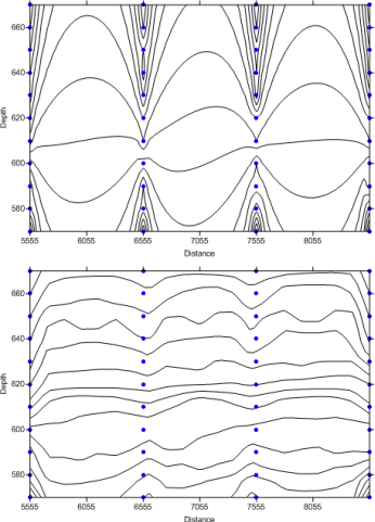
Example 3: Oceanographic Survey to Determine Water Temperature at Varying Depths
A final example where an anisotropy ratio is appropriate is an oceanographic survey to determine water temperature at varying depths. Assume the data are collected every 1000 meters along a survey line, and temperatures are taken every ten meters in depth at each sample location. With this type of data set in mind, consider the problem of creating a grid file. When computing the weights to assign to the data points, closer data points get greater weights than points farther away. A temperature at 10 meters in depth at one location is similar to a sample at 10 meters in depth at another location, although the sample locations are thousands of meters apart. Temperatures might vary greatly with depth, but not as much between sample locations.
|
|
|
|
In the oceanographic survey described here, the contour lines cluster around the data points when an anisotropy ratio is not employed. In the lower contour map, an anisotropy ratio results in contour lines that are a more accurate representation of the data. |
|
See Also
Choosing Methods Based on the Number of XYZ Data Points
Exact and Smoothing Interpolators
General Gridding Recommendations