Adding Context Layers
It's time to tell the full story of the site! Reference layers such as aerial imagery, point data for marker or well locations, or vector files containing site plans, give additional context for our groundwater level contours.
For this exercise, we'll add the well sampling locations as a post map layer. Post maps utilize the XY location to post a symbol for each point in the dataset you define. The Well_measurements.xlsx dataset contains the XY coordinates for each of our well sampling locations.
-
Click the Map object in the Contents window.
-
Click Home | Add to Map | Layer | Post.
-
Select the Well_measurements.xlsx file and click Open.
-
Click OK in the XLSX Import Options dialog.
If you completed the Data Best Practices lesson and still have the worksheet opened, you can skip to step 8!
-
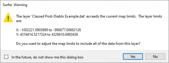
Click No on the warning stating that the layer exceeds the current map limits.
|
-
 Click the newly created Post layer in the Contents window.
 -
Click the General tab in the Properties window.
-
In the Worksheet Columns section,
-
Click in the X coordinates field and select Column C: Longitude
-
Click in the Y coordinates field and select Column B: Latitude
-
Next we will change the map properties to improve the visibility of each well location.
-
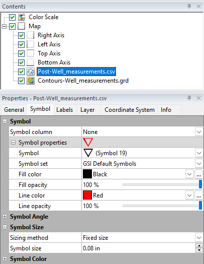
Click the Symbol tab in the Properties window.
-
Click the + next to Symbol Properties to expand the options, if needed.
-
Click in the Symbol field and select the unfilled downward triangle (Symbol 19).
-
Click in the Line color field and select Red.
-
In the Symbol size field use the up/down arrows to make the symbols larger or smaller.
As our final finishing touches let's add a Legend and a Scale Bar so it's clear what these red triangles represent and how far apart they are.
-
Click Map Tools | Add to Map | Scale Bar in the ribbon.
-
Click and drag the Scale Bar to the desired location on the map.
Note: The scale bar and map units will be adjusted in the next lesson.
-
Click Map Tools | Add to Map | Legend in the ribbon.
-
Click the Legend in the Contents window, if needed.
-
On the General tab in the Properties window, click in the Type field and select Square.
-
Add a title to your legend by entering "Well Sample Locations" in the Title Text field and then press ENTER.
You'll notice the legend includes both the symbol as well as a data value. Let's remove the data value as that information is not relevant.
-
Click the Layers tab in the Properties window
-
In the Template field, change \symbol\value to just \symbol.
-
Click and drag the legend to your desired location in correspondence to the map.
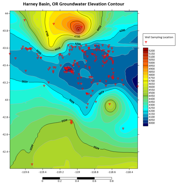
The map should now look like the image below:
|
You can add as many layers to your map as needed to provide relevant context for your audience. Additional map layers commonly include a site plan, government boundaries (DXF, SHP, etc.), and aerial imagery (PNG, JPG, TIFF, etc.) added as base layers.
To add a site plan or imagery, click Home | Add to Map | Layer | Base and then load your image or site plans. If your imagery does not have associated coordinates, the process to add the layer requires a few more steps as first you must georeference the image.
The final step to finish the map before presentation is to change the map coordinate system so that the scale is in linear units.
Back to Changing Map Properties
Next to Changing Map Coordinates